Posts

My New Photos

Image
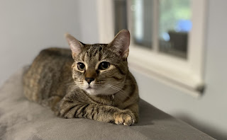
 My first photo of my cat penny was taken at my house, an image of my pepsi bottles (my favorite drink) i bought, unique flower decor in my home &  a Limestone Women’s Basketball trophy from the gym. I used tips from the videos by getting close to my subjects to make it one main focus of the picture. I also considered perspectives and angles of the photos I took so they weren’t just straight head on shots. I tried to focus on capturing good lighting for all my images. I changed the focal point of the images letting the background be more blurred out focusing on the subject I chose for my picture. These images are a few of my favorite things.

Photo Composition Principles

 1. Fill the frame with what you like Get closer to capture the best image Figure out what the photo is really about 2. Simplify & Exaggerate the photo subject Zoom in on a feature or change the focal point 3. Don't center the photo  Use the rule of thirds to make image interesting 4. Create depth by having a foreground subject Create a story for your image and make viewer feel they're standing in your photo 5. Use leading lines to give viewer a visual journey through your photo 6.Perspective is everything Change from the normal boring perspective and change angles 7.Lighting is everything Sunrise or Sunsets, Use directional lighting to your advantage Work with the sun Steve McCurry's Tips Diagonal lines create great movement Figure to ground find contrast within the image Symmetry is pleasing to the eye 

My Personal Website

https://dessy537.wixsite.com/destinyjackson 

Research Personal Sites

  As I looked through a few of the individual website designs there are a couple things I noticed and liked. I noticed how the individuals personal brand fonts matched the style or what the individual does. The bold names along the top of the website as soon as you click it I think is attention grabbing to what the website will be about. On the websites I noticed when listing their previous jobs or who they worked for, instead of just typing the company name out, they would use the direct brand logo, which I think makes the websites visually appealing. One website had a transition effect when the viewer clicks on each tab. It keeps the site engaging and the large font makes it clear what each tab is about. Overall the websites look professional and organized and each have their own little touch that makes them specific to the persons brand. For my own website, I would want to include bold fonts and transitions from each tab. I want a full detailed about me page because there's a lo...

Skype

 Skype is a piece of software that allows people around the world to talk to each other for free. Their overall mission is to allow everyone around the world to make clear and nice video calls. The Skype guide focuses on the idea of “giving users a voice”. They give the reader all the advantages of using the software. Adding the speech bubbles and the type of font used on the guide gave it a more relaxed & fun vibe to the guide as a whole. Even the logo itself gives off that this software isn’t necessarily a serious one. They just want to connect people worldwide and they make the mission clear by also giving out statistics on who downloads Skype and how many users use it.

Exploring Viral Videos

  David after the Dentist and Antoine Dobson were both two viral videos from 10 years ago. Both of these videos went viral on the YouTube platform.     David’s viral video all started from the youngboy going to the dentist to get his tooth pulled and his father caught his reaction to the anesthesia once the procedure was complete. The video was released January 30, 2009 and as of now the video has been viewed 141 million times on YouTube. David is now attending the University of Florida and has since had interviews about becoming a viral sensation. David After Dentist: https://www.youtube.com/watch?v=txqiwrbYGrs       The next viral video I chose was Antoine Dobson. At the time he was a resident in Huntsville, Alabama, he gave a local interview to the news about a home invasion and attempted rape of his sister. The interview went viral in 2010. The video was made popular because he began declaring “Hide your kids , Hide your wife”. This cause...

Destiny's View: 25 Year Bet On Technology

Image
  Kevin Kelly was Wired's executive editor back in 1995 and decided to interview author Kirkpatrick Sale but Kelly planned an ambush. Kelly hated Sale's book and outlook on technology throughout the book. He believed that Sales thesis insulted the world. The interview overall was controversial because of their split and opposite views on the subject. Sale just believed that technology could be the collapse of society while Kelly saw the opposite and technology as an opportunity for society to flourish.      Kelly came to the apartment with the intention of betting Sale. He arrived with a $1,000 check to make a bet with Sale. The bet was that by 2020 we wouldn't be in a disaster due to technology. Both gentlemen agreed to this bet. In May 2020, Kelly and Sale settled on the terms of the decision. They split their thoughts into categories. When it came down to the economic collapse, Sale believed that money would be considered worthless in 2020, which we all know to no...